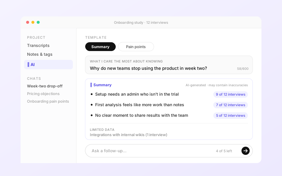
The short version
We were losing deals to a competitor whose AI "felt stronger", even though ours had more features. I diagnosed why, made the case for collapsing our workflow into one AI experience, scoped it to ship, and launched it.
The problem showed up in sales calls, not usability tests
In early 2024 the same sentence kept appearing in sales recordings and trial feedback:
On paper this didn't add up. We had auto-tagging, AI notes and insight generation, as many AI features as the competitor or more. So I treated it as a strategy question rather than a feature request, and ran a structured win/loss analysis across six companies: lost-deal calls, in-pipeline email threads and trial feedback sessions. I paired it with a direct feature comparison against the competitor named most often.
The gap was in the mental model, not the feature list
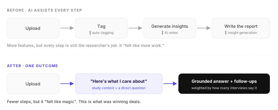
To check the diagnosis against real use, I did the job myself. I ran full analyses on live customer research projects and watched weeks of session recordings. Four things stood out:
- Researchers wanted to give the AI context, such as what the study was about and what mattered most, but there was nowhere to put it.
- Confidence mattered more than generation. Every output had to trace back to something a participant actually said.
- The bottleneck was getting from analysis to something shareable, not note-taking or tagging.
- Output quality followed the quality of the question. With a clear question the results were great. Without one, users got generic themes.
A gap nobody in the market had closed: context-aware, cited, conversational analysis
I ran real research data through each competitor's AI rather than judging from screenshots, to see what the models could actually do and how each product's UX shaped the output.
| Competitor | Strength | Gap we could own |
|---|---|---|
| Notably | Strong structured output from templates | Rigid. If your question didn't fit a template, you were on your own |
| Qoqo | Fast, surface-level synthesis | No citations, so outputs couldn't be verified |
| Dovetail | Polished clustering and analysis | Still workflow-shaped. You couldn't ask a direct question and get a direct answer |
Positioning
None of them let a researcher say "this was a retention study, and I care most about week-two drop-off." Combining study context, follow-up questions and answers backed by transcript evidence was a defensible position. It also leaned on what Looppanel already did well: transcripts and clips.
Two options went to the team. We chose the bigger direction and shipped a smaller first version
Option A: Lite
Enter what you care about, get a summary, regenerate. No templates, no follow-ups.
Bet: researchers just want the summary.
Pros: fast to build, low risk. Cons: easy to copy, and it never reaches the "ask your data" experience that was winning deals.
Option B: Templates + follow-ups
Pick a template, add study context, then drill down with follow-up questions in a conversation that remembers what came before.
Bet: the value isn't the first answer. It's being able to dig deeper.
The team pushed it further: being able to iterate mattered more than having many templates, and citations would be the trust layer.
How I scoped v1
- In: one Summary template, a 600-character context field (raised from 300 because real studies need room), up to 5 follow-ups, editable instructions, suggested next questions, and an "AI-generated" disclaimer on every answer.
- Deferred: citations, which needed hybrid search plus a check of every claim on the backend; more templates; versioning per template.
- Guardrails: 30 conversations per workspace, 5 follow-ups per conversation, and projects of fewer than 20 files. These kept quality and model cost predictable while we learned.
Trade-off
Deferring citations was the hardest call, because trust was the north star. Waiting for them would have meant months of backend work before any market learning. We shipped the conversation first and built citations on top once the context architecture was in place.
I tested what the model could do before designing any screens
The biggest risk wasn't the UI. It was whether the model could produce output a researcher would trust. So I spent a week in the OpenAI Playground running prompt variants against real research data before opening Figma, and set a quality bar based on how researchers judge evidence:
- Frequency over vividness. Weight findings by how many transcripts mention them, not by how often a topic comes up. Otherwise one compelling quote counts as much as a pattern across ten interviews.
- Separate limited-data themes so thin evidence is never presented as a finding.
- Participants only: summarise what interviewees said, never the interviewer.
- Refuse out-of-scope questions. In QA on staging I caught follow-ups that invented answers, and fixed the guardrail prompt on the spot so the model says it couldn't find anything rather than hallucinating.
I then tested the staging build end to end on real projects before each release, logging bugs and experience gaps, such as a "Copy" button that was live while nothing had been generated, and clear messaging when users hit the usage caps.
Shipped behind a flag, measured from the first week, extended within three weeks
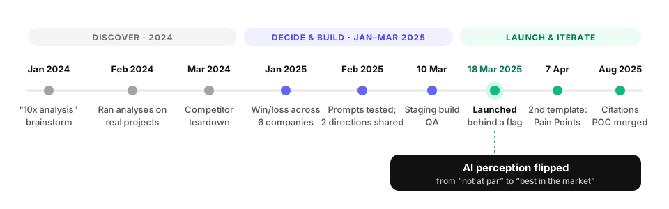
The wizard went live on 18 March 2025 behind a feature flag. Analytics were live three days later, the second template shipped on 7 April, and the citations proof of concept was merged in August once the context architecture could support it.
The perception gap closed, and showed up in revenue
Market sentiment flipped. Users who had said "your AI isn't at par" started saying "Looppanel's AI is the best in the market."
Lessons for building AI products
Win/loss is product input
The clearest brief came from understanding why we lost deals, not from a workshop.
Model capability before UI
Prompts are product decisions. Test what the model can do before committing to screens.
Trust is the product
For expert users, traceable evidence is what makes the output usable at all.
Scope to learn
One template and five follow-ups was enough to prove the bet and start winning deals.
See how it was designed
Prompts, the two design directions, UI decisions and the build QA log.
Design case study →