I started with a simple question that became an obsession
During a casual conversation with friends about online shopping, someone said: "I would never buy from Snapdeal." When I asked why, they couldn't articulate it. "It just feels... off. Not trustworthy."
This comment stuck with me. Snapdeal was once a major player in India's e-commerce wars. What changed? And more importantly—could I find the specific UX decisions that made users feel that way?
What began as curiosity for my semester thesis turned into a four-month deep dive that revealed something far more interesting than "bad design." I discovered patterns that explained not just why Snapdeal struggled, but what invisible forces make users trust—or distrust—any e-commerce platform.
The numbers told a brutal story
I pulled up the Alexa rankings for India's top e-commerce platforms. The gap was stark.
Users spent nearly twice as long on Amazon compared to Snapdeal. Snapdeal's bounce rate was nearly 40%—meaning 4 out of 10 visitors left immediately. The numbers were damning.
But numbers don't tell you why. They don't capture the moment a user loses trust. They don't reveal which design decision broke the experience. I needed to go deeper.
I analyzed these platforms methodically
My approach was systematic and thorough. I needed to see patterns that users felt but couldn't name.
First, I deconstructed every detail
For weeks, I studied Amazon, Flipkart, Myntra, IndiaMart, and Snapdeal. Not as a shopper—as a forensic investigator. I catalogued everything: color palettes, grid systems, how icons were styled, where persuasion cues appeared, how navigation flowed.
Slowly, patterns emerged. The top performers weren't just "better designed"—they followed specific principles that Snapdeal violated repeatedly. Inconsistent buttons. Cluttered interfaces. Recommendation systems that felt random rather than intelligent.
But something was still missing. I was documenting symptoms, not causes.
Key Competitive Insights
- Strong recommendation engines keep users engaged by surfacing previously viewed items
- Multiple persuasion tactics (time-based deals, personalized messaging, subscription plans) drive purchases
- Simplified navigation with visual cues helps users find products faster
- Prominent search bars and filters accommodate different shopping behaviors
Then I found the usability breakdowns
I ran a heuristic evaluation using Nielsen-Norman's principles. The exercise was revealing—and uncomfortable. Snapdeal failed on nearly every dimension where Amazon and Flipkart excelled.
But here's what surprised me: It wasn't catastrophic failures. It was death by a thousand cuts. A progress indicator missing here. An inconsistent button there. Small violations that individually seemed minor but collectively destroyed trust.
Multiple status indicators
Progress bars, icons, animations, and next-step suggestions keep users informed at every stage.
Sparse feedback
Limited system status visibility leaves users uncertain about where they are in the process.
Consistent design language
Action buttons, icons, and layouts maintain consistency across all pages, reducing cognitive load.
Inconsistent patterns
Varying button styles and inconsistent navigation confuse users and slow down task completion.
Finally, I talked to real people
The data was telling me what was broken. But I needed to understand why it mattered.
I interviewed 10 people who shop online regularly. I didn't ask "what features do you want?" That question gets you feature requests, not insights. Instead, I asked them to walk me through their last shopping experience—the good, the frustrating, and the moments they almost gave up.
That's when everything clicked.
Trust. That was the invisible metric. Every design decision either built trust or eroded it. And once lost, trust was nearly impossible to rebuild.
Two people kept appearing in every conversation
As I analyzed interview transcripts, two distinct personalities emerged. Not demographics—mindsets. I named them and built their stories.
A busy data scientist who values time above all else. She knows exactly what she wants and expects to find it quickly. Quality and reliability are non-negotiable.
- Struggles to trust products after bad experiences
- Hates cluttered interfaces with information overload
- Uncertain about fit and quality, especially for clothing
- Wants automation wherever possible
A streamlined, 3-step checkout process. Complete product information upfront. Assurance that delivered products match descriptions. Fast, hassle-free returns.
A college student who loves exploring and discovering unique products. Budget-conscious but curious. Relies heavily on reviews and peer opinions before making decisions.
- Regrets impulsive purchases when products disappoint
- Wants to explore but lacks financial flexibility
- Needs detailed information to justify spending
- Compares same product across multiple platforms
Detailed product descriptions with real user photos. Transparent pricing and quality indicators. Easy order cancellation. Sample-sized options for trying new products.
The moment I realized the real problem
Late one night, reviewing interview notes for the dozenth time, something hit me. Users weren't comparing features. They were assessing risk.
Every interaction was a trust transaction. Will this product look like the photo? Will it fit? Can I return it easily? Is this seller legitimate? Platform choice wasn't rational—it was emotional risk management.
And Snapdeal failed every trust test.
Trust is fragile
One bad experience—wrong size, poor quality, misleading photos—permanently damages platform loyalty. Users need constant reassurance.
Fit is a gamble
Standard sizing information isn't enough. Every brand fits differently, and users have no way to judge fit online, leading to returns.
Time pressure is universal
Whether it's the busy professional or the exploring student, everyone wants to find what they need faster. Search and discovery must adapt.
Context matters
Users shop for specific occasions and needs, but platforms treat every visit the same. Personalization should anticipate life events.
What if we could eliminate uncertainty entirely?
Once I understood that trust was the core problem, the solutions became obvious—though implementing them would be anything but.
I proposed four features that directly addressed user anxieties. Not incremental improvements. Fundamental rethinks of how e-commerce could work.
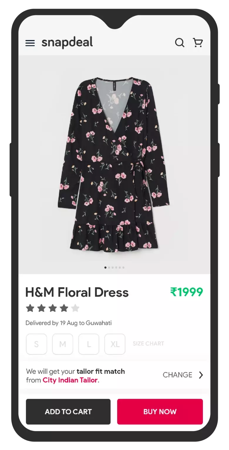
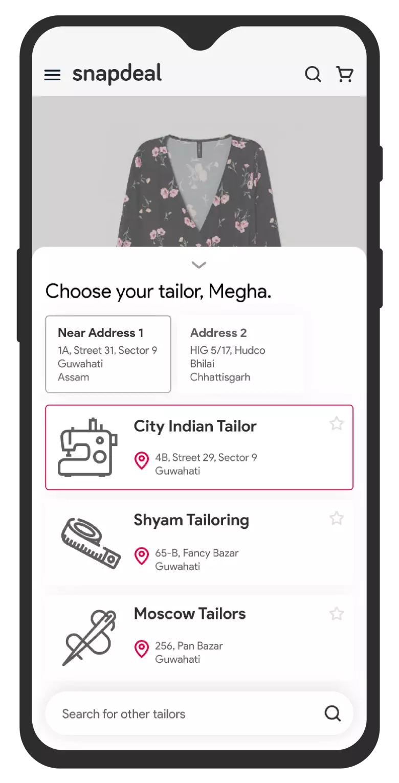
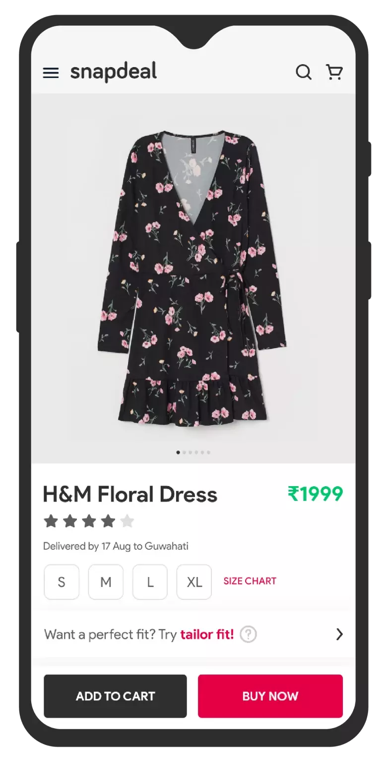
1. What if your local tailor knew your size online?
The biggest anxiety in clothing shopping: "Will this actually fit me?" Standard sizes mean nothing when every brand fits differently.
My solution: Partner with neighborhood tailors. Users visit once, get professionally measured, and those measurements live in the system forever. When browsing shirts, the platform doesn't just show "Medium"—it shows "This will fit based on your measurements from Sharma Tailors."
It solves the fit problem while supporting local businesses. Win-win.
Why This Works
- Builds trust through professional measurement accuracy
- Reduces returns by ensuring correct fit from the start
- Creates ecosystem value by supporting local tailors
- One-time setup with lasting benefits across all purchases
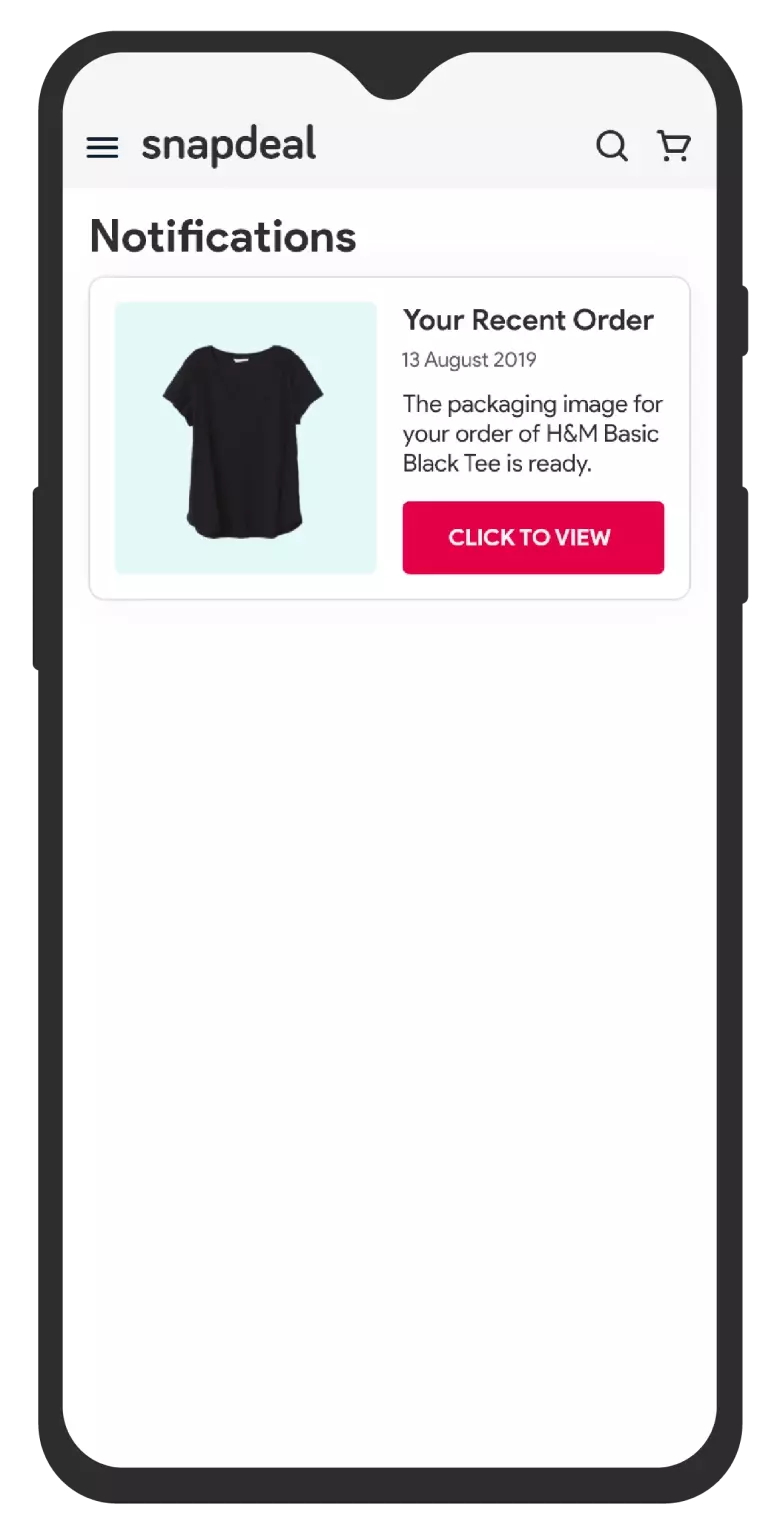
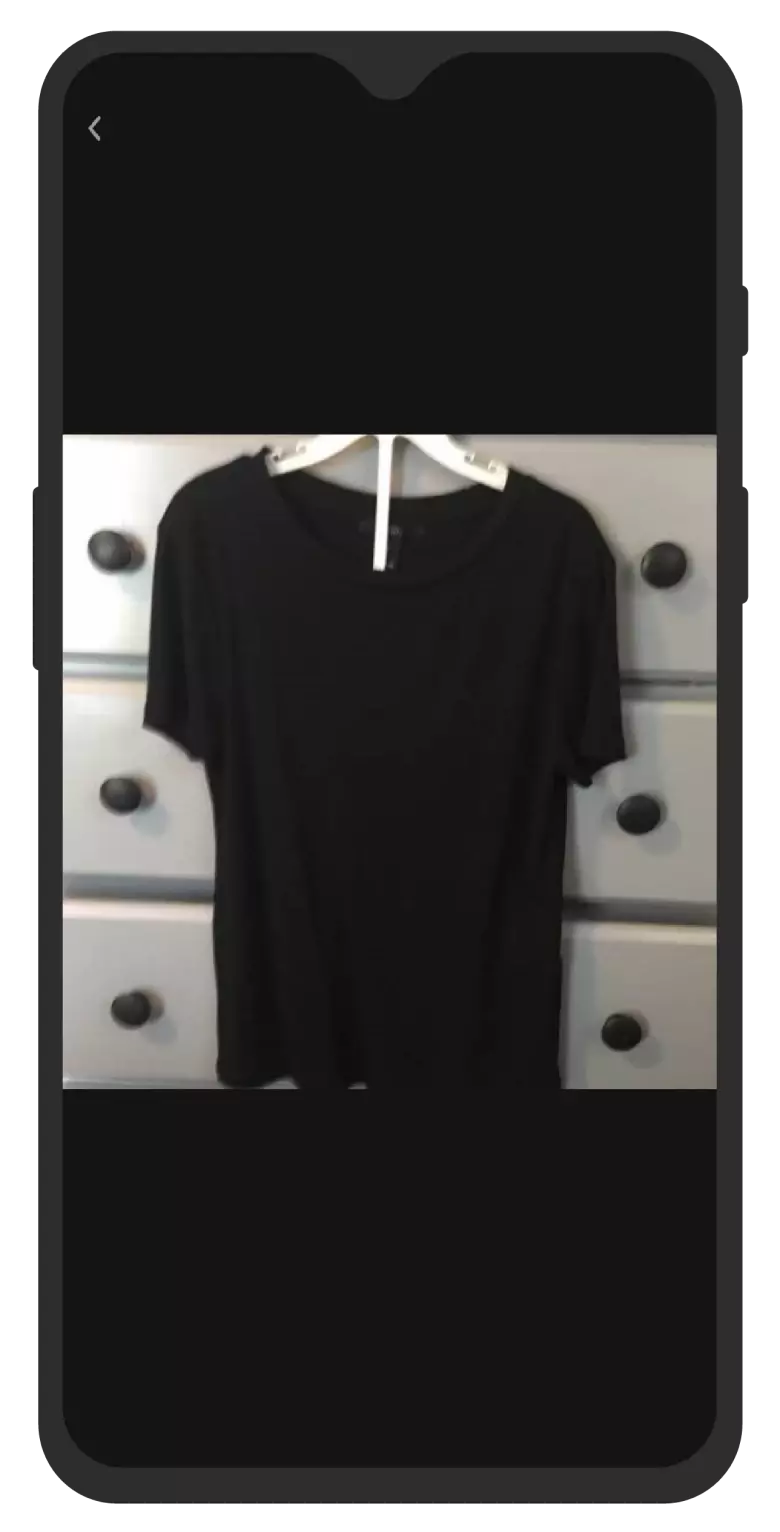
2. Show me the ACTUAL product you're sending
"The product looked different in real life" — the most common complaint. Marketing photos are styled, lit, edited. Reality disappoints.
Radical transparency: Before packing your order, the warehouse photographs the exact item being shipped. You get the photo. You have 2 hours to confirm or cancel.
No more surprises. No more "this isn't what I ordered." Just honesty. And honesty builds trust faster than anything else.
Why This Works
- Eliminates uncertainty about product authenticity
- Prevents disappointment by setting correct expectations
- Builds confidence in the platform's honesty
- Reduces negative reviews from mismatched expectations
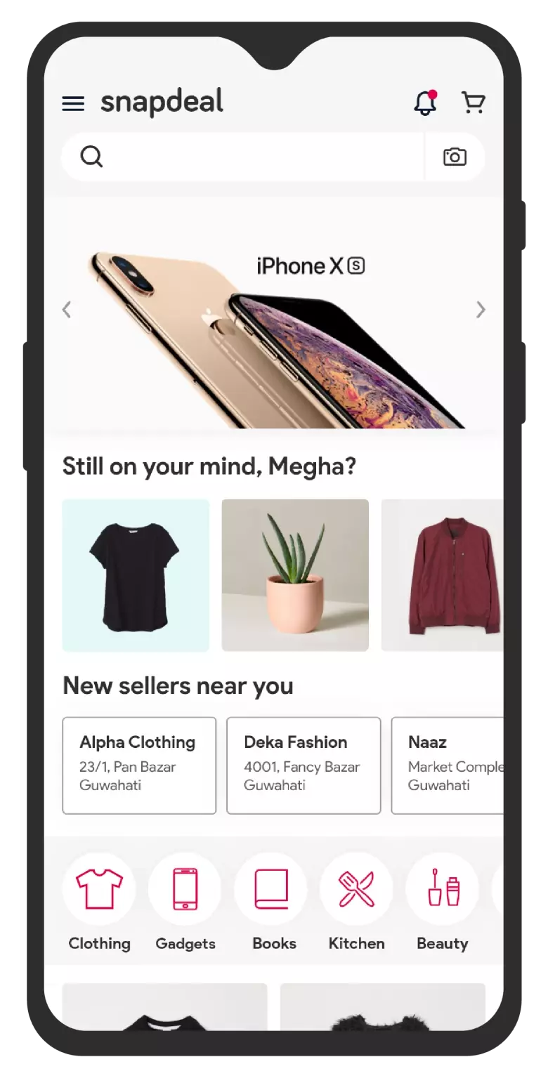
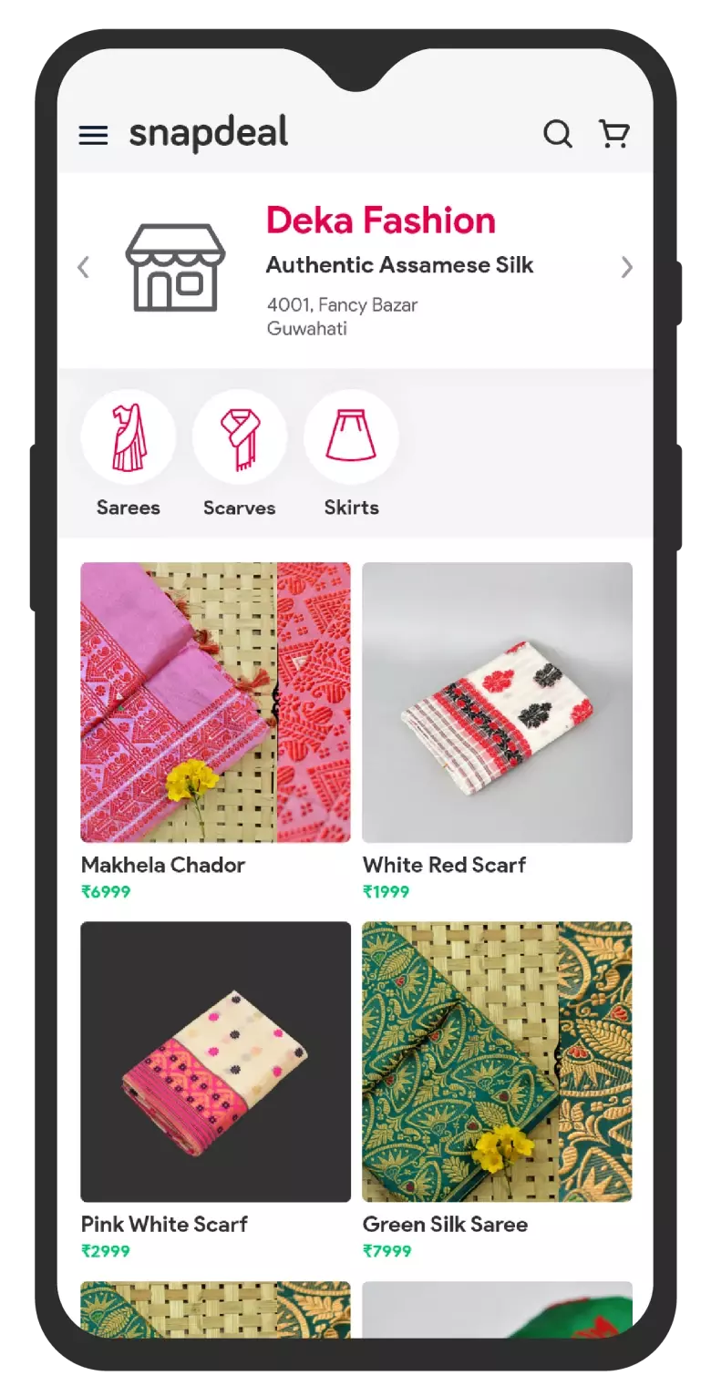
3. Buy from shops you already trust
Here's what surprised me in interviews: People miss their neighborhood stores. They know the owner. They've shopped there for years. That trust took time to build.
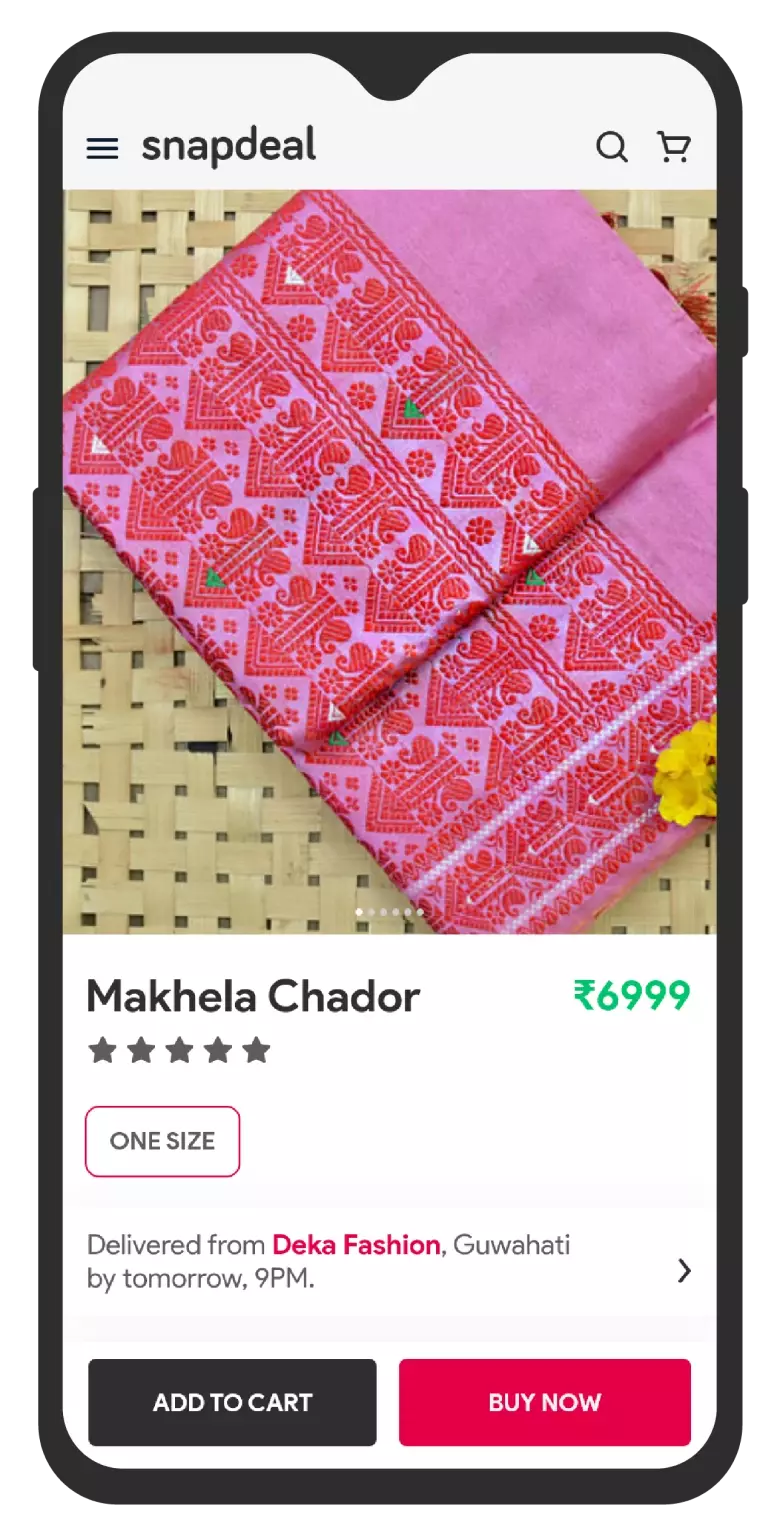
What if you could buy from your favorite local shop—but with online convenience? List neighborhood stores on Snapdeal. Same-day delivery because they're five minutes away. The emotional safety of a familiar brand with the ease of clicking "buy."
E-commerce doesn't have to kill local retail. It can amplify it.
Why This Works
- Leverages existing trust in familiar businesses
- Enables ultra-fast delivery from nearby locations
- Supports local economies while providing convenience
- Creates emotional resonance with shopping experience
4. What if the app knew what you needed before you did?
"I waste so much time searching for things I need for specific occasions," one user told me. Birthday gifts. Travel essentials. Anniversary surprises.
Calendar integration. Not creepy—helpful. Your friend's birthday is next week? Here are thoughtful gift ideas. Vacation next month? Travel checklist ready. Anniversary in two days? (You're welcome.)
The platform becomes a helpful assistant, not just a store. That's the kind of experience people remember.
Why This Works
- Saves time by surfacing relevant products proactively
- Feels helpful rather than intrusive
- Increases engagement during life moments
- Differentiates from competitors through predictive intelligence
When your thesis becomes published research
What started as "why don't people like Snapdeal?" became something bigger. My advisor, Dr. Debayan Dhar, saw potential beyond a semester project.
We turned the research into a paper that challenged conventional e-commerce UX wisdom. It wasn't just "here's what's broken"—it was "here's why trust is the invisible metric everyone misses, and here's how to design for it."
The paper was accepted to ICoRD'21, one of the premier conferences in design research. Honestly? I didn't expect that. But apparently, the question that started as casual curiosity resonated with researchers worldwide.
What this project taught me about design
This was my first comprehensive research project. I started with a question and a lot of curiosity about why users made the choices they did.
That curiosity became rigor. I learned that good research isn't about confirming what you already believe—it's about staying open to what the data tells you, even when it surprises you.
The trust insight? I didn't go looking for it. It emerged from hours of sitting with interview transcripts, looking for patterns I almost missed. That taught me patience. The best insights don't announce themselves.
What I'd Do Differently
- Talk to more users earlier — I spent too long in competitive analysis before understanding real user needs. Next time, I'd start with people.
- Prototype the wild ideas — I proposed four features but never built working prototypes. Testing them would have made the research even stronger.
- Focus on one deep problem — I tried to redesign everything. Looking back, going deep on the "trust" problem alone would have been more impactful.
The biggest lesson? Great design starts with honest curiosity about why people behave the way they do.
Features are easy. Anyone can copy a competitor's interface. But understanding the invisible forces—trust, anxiety, emotional safety—that drive real decisions? That's where differentiation lives.
Four months of research condensed into one sentence: Design isn't about making things look good. It's about making people feel safe.