Project overview
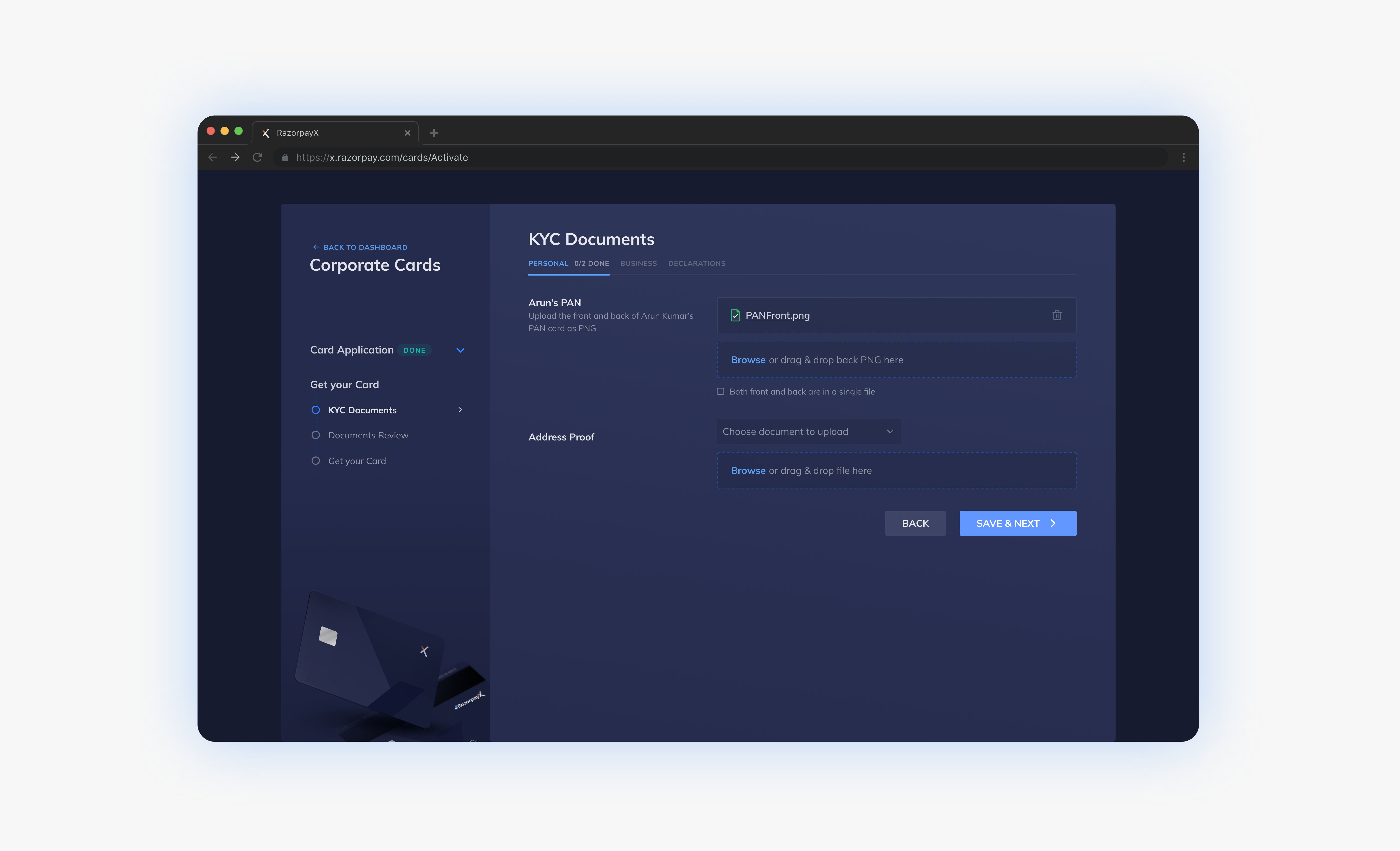
Transformed an offline, friction-heavy document submission process into a seamless in-app experience that reduced drop-offs and eliminated dependency on support teams during credit card applications.
About Razorpay Capital
Razorpay is India's leading fintech company serving thousands of businesses and startups. The Corporate Credit Card is a flagship lending product that helps businesses optimize cash-flow with interest-free credit periods, automate subscription payments, and maintain clear separation between business and personal expenses.
Capital is a new business unit prioritizing bias for action and rapid experimentation. With only foundational design tokens defined, I had flexibility to design custom UI components tailored to project needs.
.png)
The offline bottleneck
To apply for the credit card, users had to email 10+ documents to support teams—a critical step in the 5-7 day approval journey. This offline process created significant friction.
High Friction
Users faced confusion about requirements, intrusive communication channels, and lengthy completion times.
Team Dependency
Progress relied entirely on Sales and Ops team availability, creating bottlenecks and delays.
Drop-offs
The demanding, unclear process led many users to abandon applications mid-flow.
Understanding the current state
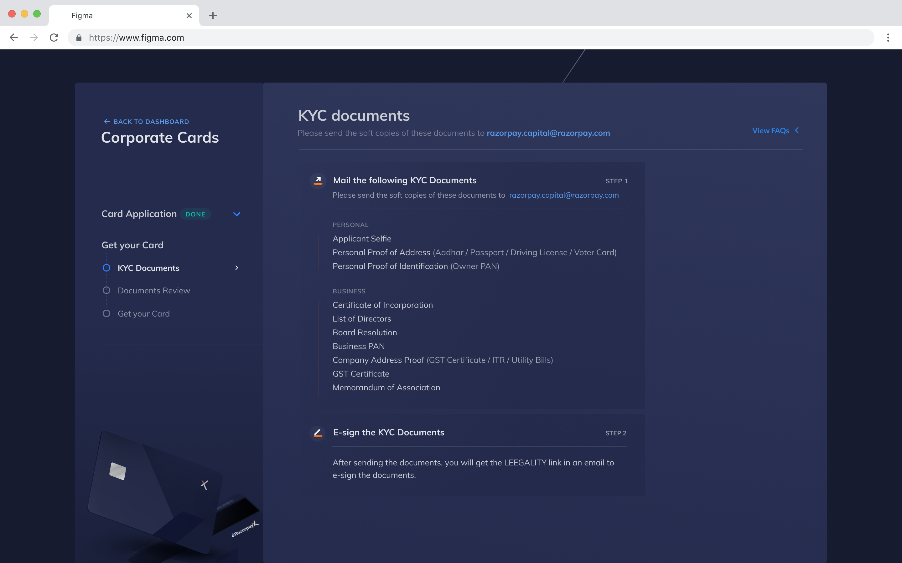
I analyzed the complete sign-up journey to identify where document submission fit within the larger flow. The existing dashboard showed a static list of required documents with an email address—offering no feedback, progress tracking, or clarity.
Time constraints limited traditional user research. Instead, I collaborated closely with Sales and Operations teams who interact with users daily, gathering insights about common pain points and user questions during the document submission phase.
.png)
The dashboard showed only a static list with an email address:
From analysis to execution
I broke down the document upload task step-by-step, identifying questions about scope, information requirements, and interaction patterns. This helped map multiple solution approaches—from progressive disclosure to tabbed layouts.
Design Principles
- Chunking — Divide demanding tasks into intuitive, smaller chunks
- Enabling small wins — Give users frequent accomplishment for a multi-day process
- Seamless flow — Maintain consistency while moving between tasks
.png)
The team prioritized speed over perfection, scoping Phase 1 to the ideal flow with error-handling deferred to future iterations:
.png)
Wireframing
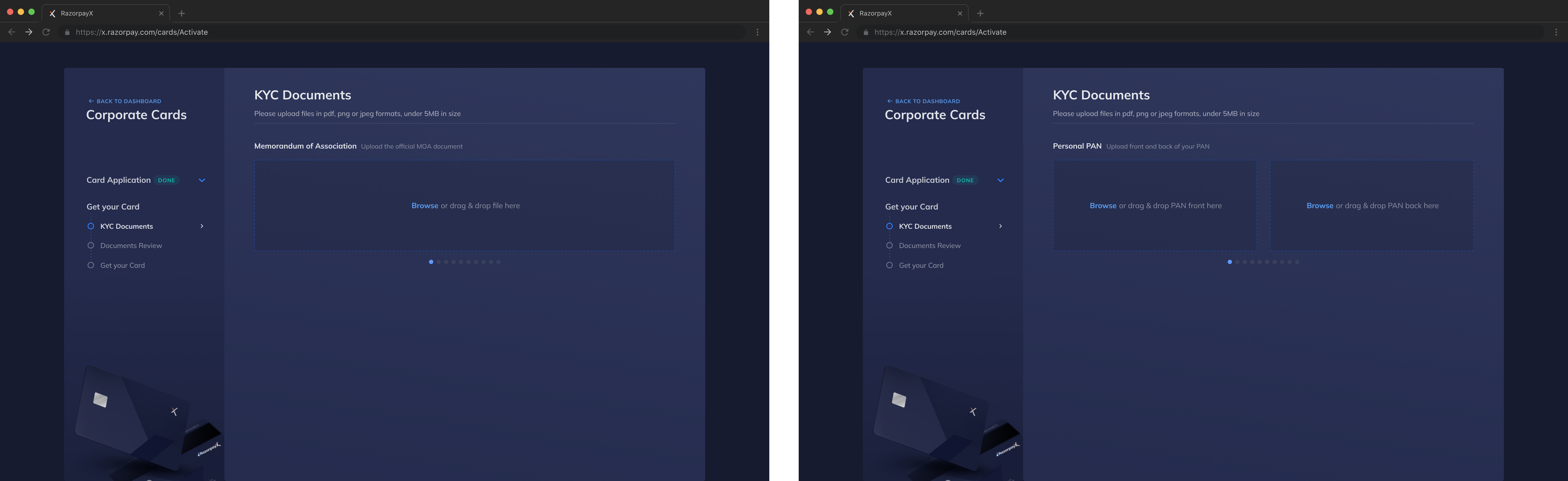
I started with low-fidelity wireframes to explore different layout approaches and interaction patterns for the document upload flow.







Layout Explorations
I explored three layout directions: progressive disclosure (focused but demanding), card-based tabs (realistic but not scalable), and page-wide components (consistent but overwhelming).
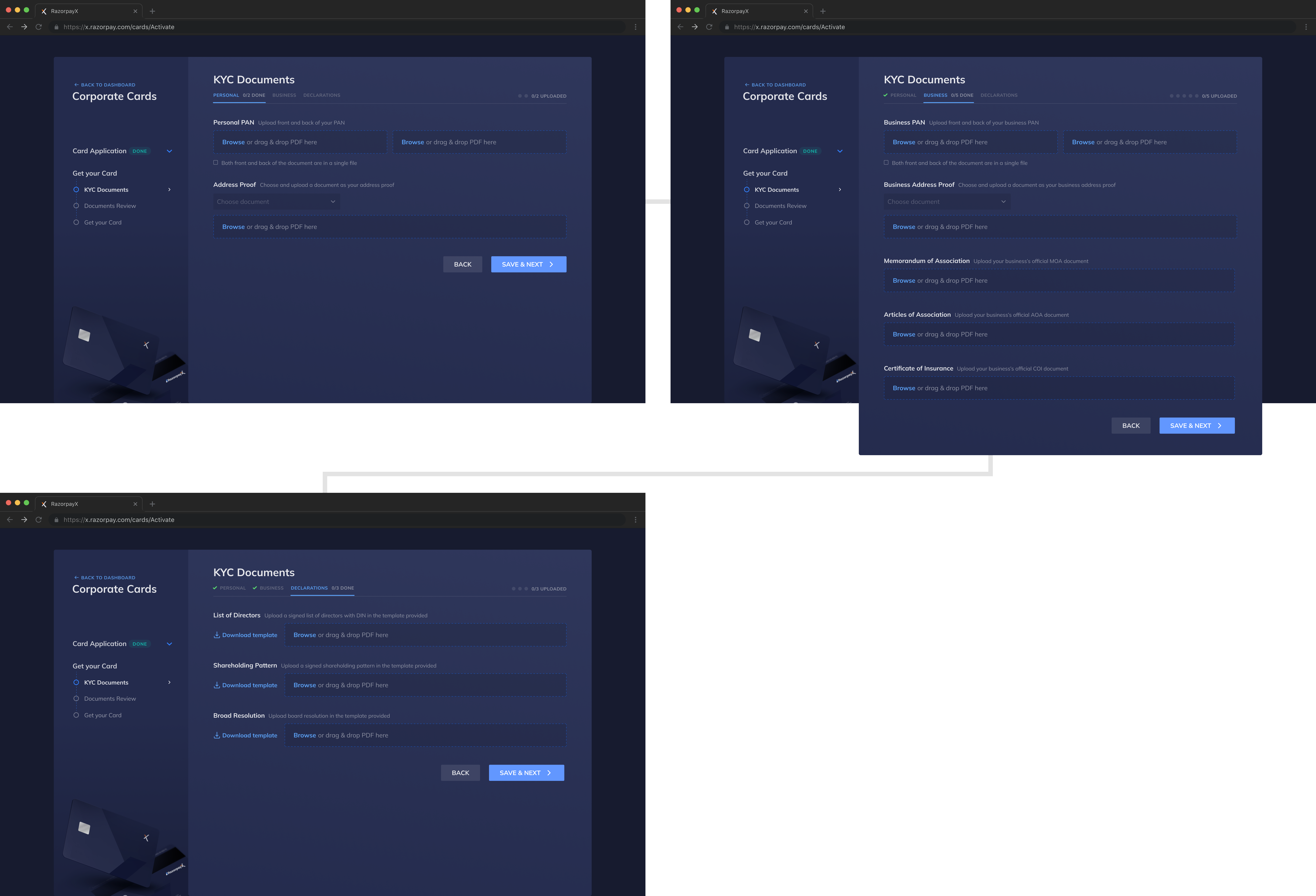
In-app document upload
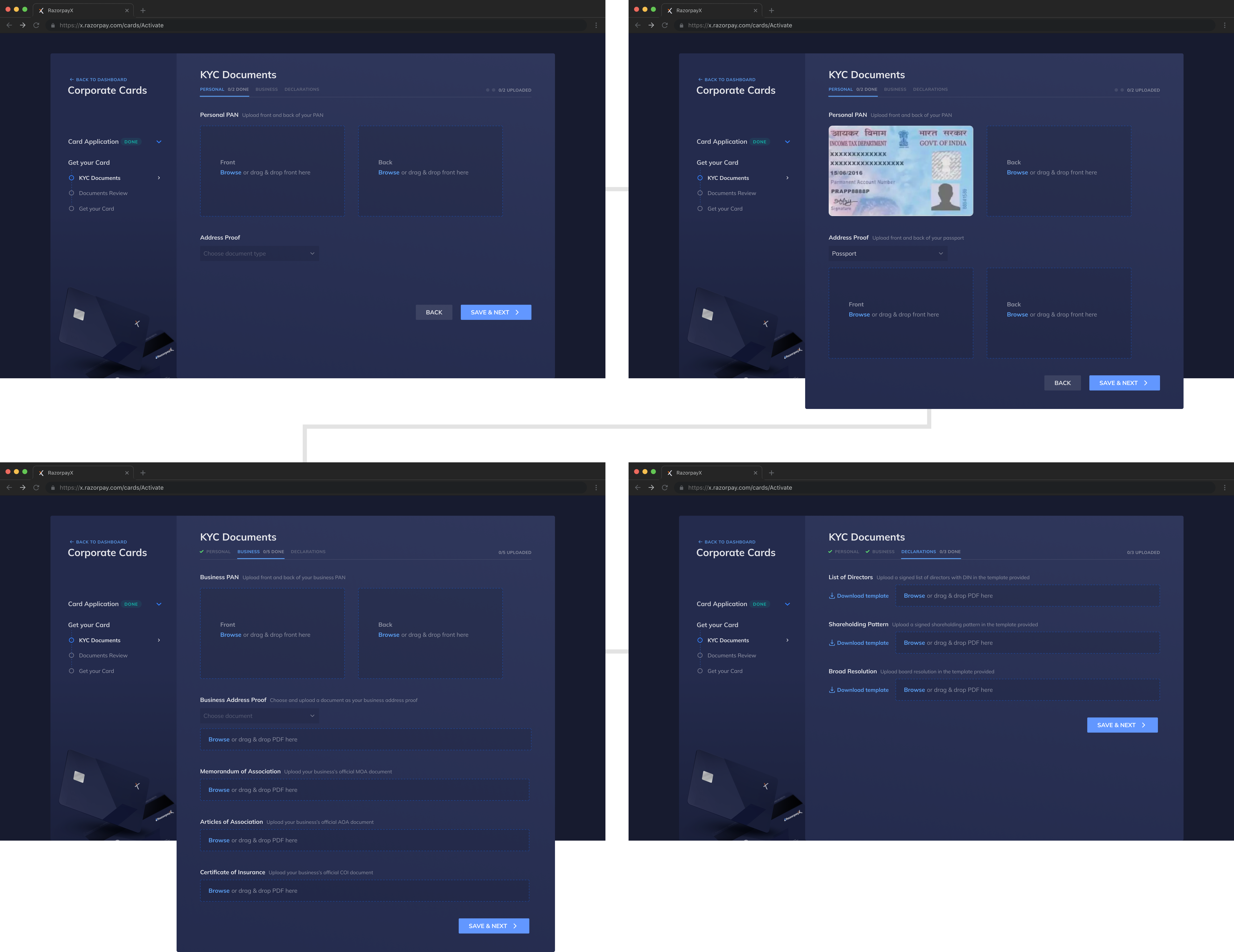
The final solution transforms document submission into a self-serve, guided experience with clear progress indicators and contextual help.
Organized by Document Type
Documents are grouped into Personal, Business, and Declarations tabs. Special attention to Declarations—documents requiring users to download templates, print on company letterhead, and obtain stakeholder signatures—keeps complex tasks clearly separated and actionable.
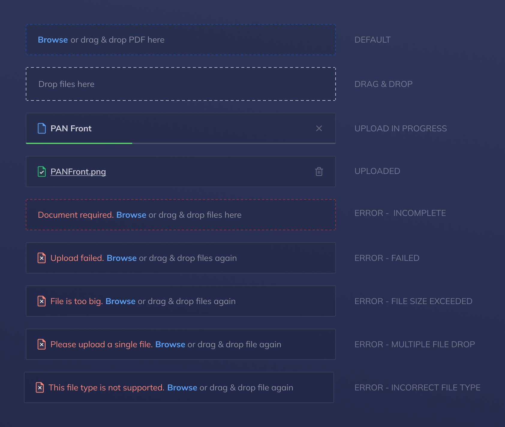
Smart Upload Components
Each document has its own upload area with clear labels, format requirements, and real-time feedback. The page-wide layout maximizes space while maintaining consistency across different document types and proportions.
Shipped in November 2021
The redesigned flow shipped after a 1-month sprint, eliminating offline coordination entirely and enabling users to submit documents independently at their own pace.
By moving the entire process in-app, users gained control and visibility while Sales and Operations teams were freed from coordination overhead. The phased approach allowed us to ship quickly and iterate based on real usage patterns.
What I learned
Key Takeaways
- Balancing speed and craft — Shipped a focused V1 to solve core problems, then iterated based on real user behavior
- Alternative research methods — Collaborated with Sales and Ops teams to gather insights when traditional user research wasn't feasible
- Designing for self-service — Giving users autonomy and control over their timeline reduced friction more than just simplifying tasks
- Component thinking — Flexible, reusable upload components enabled faster iteration and future feature development