The short version
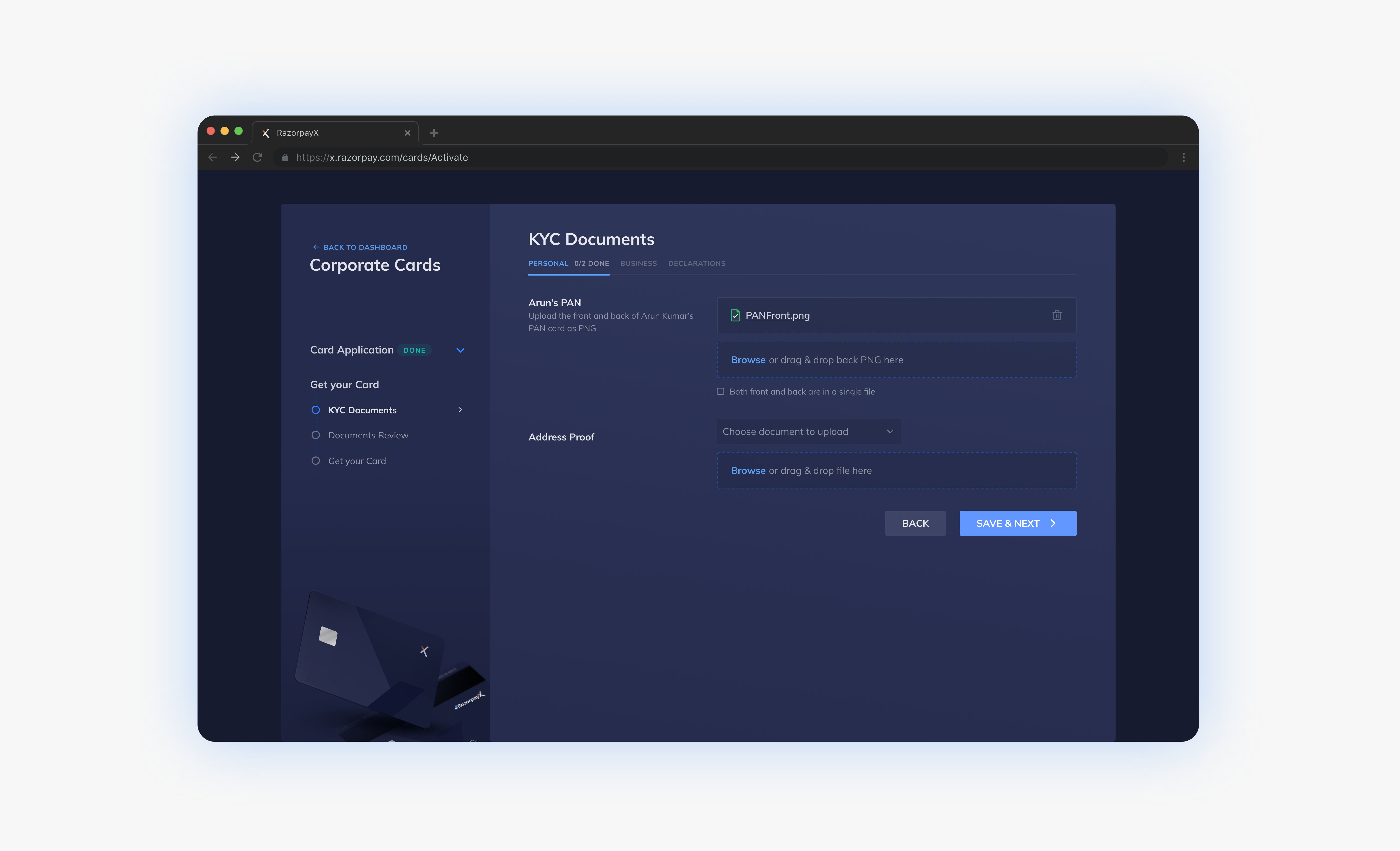
Applying for Razorpay's corporate credit card meant emailing 10+ documents to a support inbox and waiting. I turned that step into a self-serve, in-app flow, scoped to ship in a one-month sprint.
In lending, the application funnel is the revenue funnel
The Corporate Credit Card was a flagship product for Capital, Razorpay's new lending unit. It helps businesses manage cash flow with interest-free credit periods, automated subscription payments and a clean split between business and personal spend. Every application that stalled was lost credit volume.
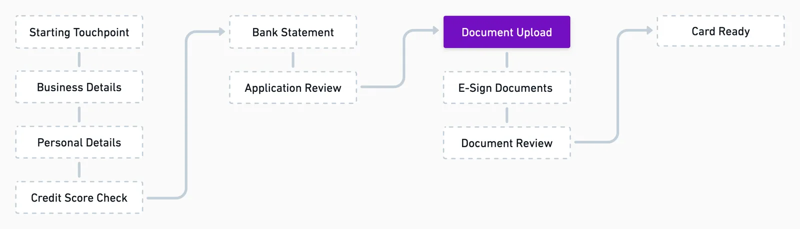
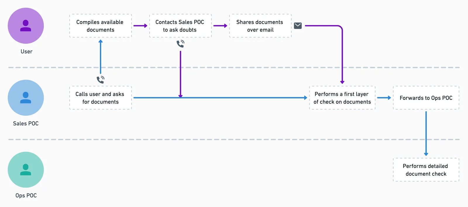
The biggest stall point was document submission. Applicants had to email 10+ documents to support, partway through a 5–7 day approval journey. That created three compounding costs:
- Drop-offs: unclear requirements and a demanding process led applicants to abandon mid-flow.
- Ops dependency: progress depended on Sales and Ops availability, so the funnel could only grow as fast as headcount.
- Poor experience at a high-trust moment: applicants had no feedback or progress tracking, just a static list and an email address.
No time for formal research, so I went to the people who heard from users every day
Capital ran on a bias for action, and the timeline ruled out a full research round. Instead I worked with Sales and Operations as a proxy for users. They fielded the questions, confusion and follow-ups at this step daily. I combined their input with an audit of the full sign-up journey to see exactly where document collection broke down.
Key insight
The documents weren't the hard part. Not knowing what was needed, and getting no sign of progress across a multi-day task, was. Giving applicants autonomy over their own timeline would reduce friction more than simplifying any single upload.
Three structures, judged on focus, realism and scale
| Option | Upside | Downside |
|---|---|---|
| Progressive disclosure (one step at a time) | Focused | Demanding across a multi-day task, and hard to see the whole |
| Card-based tabs | Realistic to build | Didn't scale to the variety of documents |
| Page-wide components grouped by type (chosen) | Consistent and scalable, with each document getting its own upload area | Could feel heavy, so I grouped documents into Personal, Business and Declarations tabs |
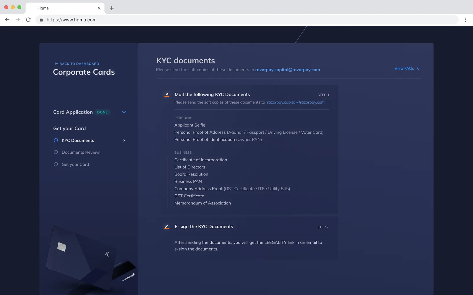
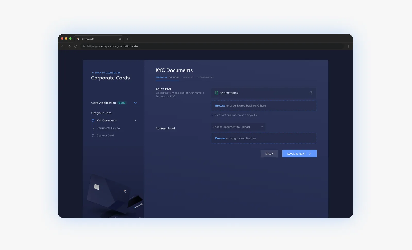
Declarations were the hardest item: users had to download a template, print it on company letterhead and get it signed. Isolating them in their own group kept the complex task clear and actionable instead of hidden among simple uploads.
Scope call
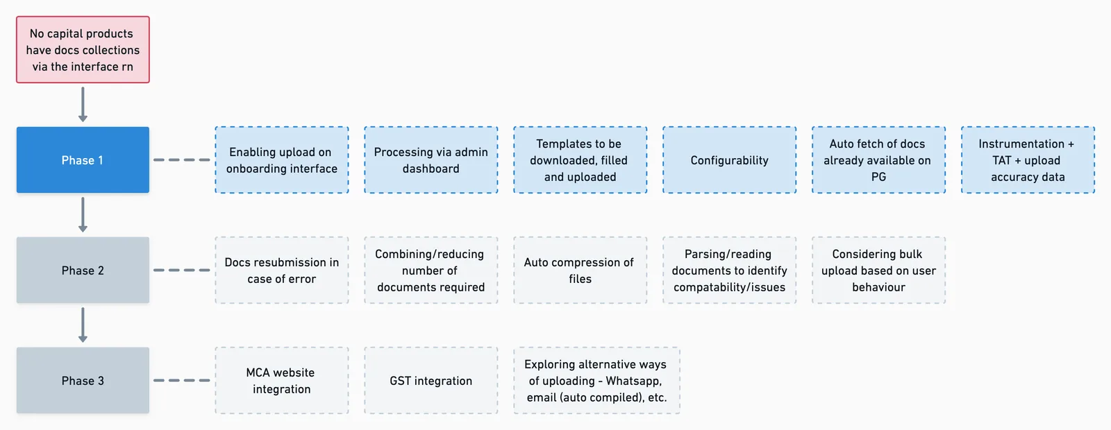
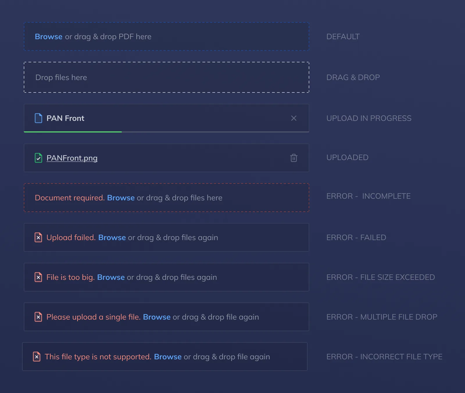
The team prioritised speed. Phase 1 shipped the ideal flow, with thorough error handling deferred to the next iteration so we could learn from real usage rather than guess at edge cases.
The offline step disappeared
Applicants gained control and visibility, and Sales and Ops stopped coordinating document collection over email. This was part of my wider work making onboarding self-serve across Capital products, which saved 15 ops hours per user across about 3,600 monthly applications.
How I'd measure it next time
- Document-step completion rate, and time from starting the step to the last upload
- Time from application to approval
- Inbound ops and support contacts per application
What this taught me about product work in fintech
Autonomy beats simplification
Letting users control their own timeline removed more friction than any single UI fix.
Frontline teams are a research channel
When research time is short, Sales and Ops hear the problem every day.
Ship the ideal flow, then harden it
A focused v1 shipped in a month, and real usage shaped what came next.
Reusable components cut future costs
Flexible upload components made the next document types cheap to add.
See how it was designed
Wireframes, layout explorations, the upload components and error states.
Design case study →